Email Design System, September 2020
Harvard Faculty of Arts and Sciences
Registrar’s Office
Project Roles: UX Designer, Content Strategist, Copywriter, Copyeditor
Many staff in the Registrar’s Office email the Harvard community about upcoming deadlines and processes related to the academic calendar. The team wanted a quick and easy way to send professional-looking messages. To help simplify the above process and make sure future email campaigns looked consistent, I built an email design system.
Discovery Process
Campaign Audits
To begin the design process, I reviewed old campaigns sent by each department. I scanned the messages for common characteristics – for example, what content appears consistently across campaigns? What content was text-heavy and could be simplified through new visual elements?
Staff regularly focused campaigns on the following topics: action items, deadlines, training sessions, and key resources and documentation.
Student Interviews
I spoke with students in small focus groups led by the College Communications Team and asked them questions about emails from Harvard. What did they currently dislike about the messages they received? What emails did they like to receive and why? I learned that students read emails by scanning them for key pieces of information – they receive hundreds of emails per day and simply don’t have time to read each one with careful attention. They liked emails that got to the point.
Visual Elements
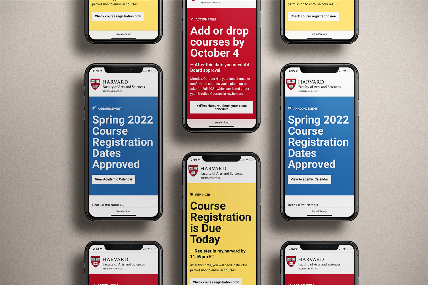
The design system includes key components such as color schemes, icons, and visual elements to highlight important information (e.g. failing to check in for the academic term by the deadline).
Based on the campaign audits and focus group discussion, I concluded that our messages needed the following content:
Put most important information upfront in the headline section
Make dates and deadlines stand out (the get lost when messages are text-heavy)
Keep templates simple; focus on typography and color to stress key points
Add all visual elements to the template so staff can delete what they don’t need and build emails quickly
Resource Cards
I colored icons from the Noun Project using Adobe Illustrator to design icons to highlight academic resources. I created bright and colorful icons to get the reader’s attention since this content is at the end of the campaign template.
Campaign Colors
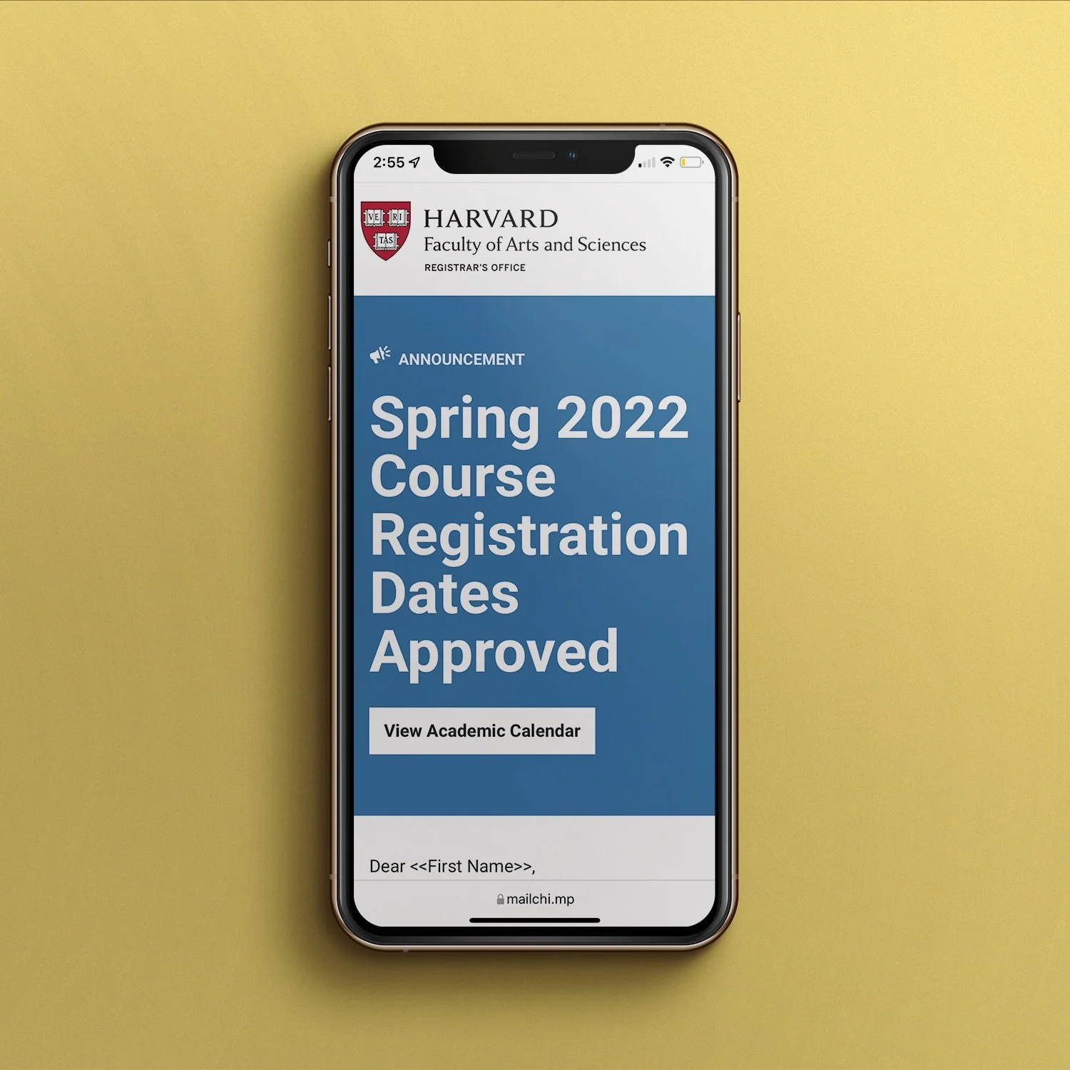
I created different color palettes for each type of email campaign based on the importance of the message. For example, Action Item emails are red to show urgency, while Announcement emails are blue, and Training emails are green.
In-Line Icons
In-line icons highlight key topics within the communication. For example, if students will be charged a fee if they miss a deadline, we make the text bold, green, and use a green icon with a $ sign to make the fee stand out.
Alert Boxes
Alert boxes can be added to the beginning of any campaign to draw the reader’s attention to highly important information (for example, to answer a question we’ve been receiving lots of tickets about).
Continued User Research
About a year later, I participated in another student focus group led by the Harvard College Communications team. I asked the students if they read emails from the Registrar’s Office. At first a student said, “I don’t think so.” Then, that same student paused and said…
“WAIT. Do you mean Mike’s emails? OMG, sometimes those have my name in them and I’m like, Mike is talking to me? Oh no, I better read this!”
(We use the Registrar’s name as the sender name.)
After that, another student chimed in…
“The Registrar’s emails are great because they always tell you what to do in the subject line. I like that I don’t even need to open them to know what I need to do.”
While this feedback came from just 2 students, it was a good sign we were were moving in the right direction.
Reflections
Using an iterative design process has been helpful for improvement for both content and design. I maintain a spreadsheet with all emails from the Registrar and note any time we receive a lot of questions about a particular topic (e.g. the text in the message was unclear and generated a lot of tickets for our team) so that we can proactively address the topic next time we communicate about it.
Regularly collecting data on the effectiveness of our campaigns, such as through focus groups and Mailchimp analytics has been transformative to the design process. We have been able to make improvements to our template based on how users respond to the design.
Interviewing more audience groups in the future is necessary. I’ve spoken with students about the template but have not had in depth discussions with instructors or staff – these groups make up a large portion of our audience and have different content needs than students.
New staff may want different features to make campaigns easy to build. Our team has many new staff members who haven’t used the design system and may find additional visual elements helpful.


